Argento Home homepage is a standard Magento’s CMS page. You can edit it at Magento Admin > Content > Pages page.
A page title is Argento Home. Url - home.
In the KB article, we show you the main elements of the homepage. You will see the code of the homepage elements. So you can always use them to find and edit the required element faster.
Note: We recommend disabling the WYSIWYG editor before you start editing homepage content.
The homepage uses a bunch of widgets with a broad range of customization options.
- Currently, the homepage is built with jumbotrons. We used a similar approach in Argento Flat. Read the Jumbotron customization article.
- You can structure elements with Argento grid system classes (col-md-8, col-md-4 etc) as well.
Slider
The top homepage slider is powered by Easy Slider. Visit the module page to see the full list of customization options.
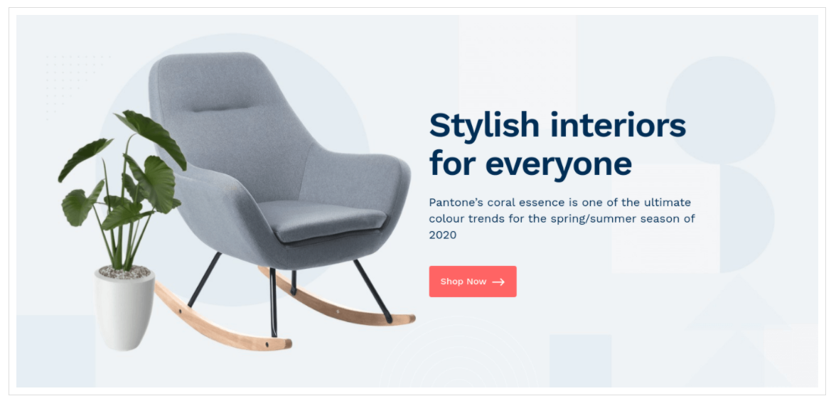
Slider identifier is argento_home.
Here is a piece of CMS Page content that adds slider:
<div class="jumbotron jumbotron-image no-padding">
    {{widget type="Swissup\EasySlide\Block\Slider" identifier="argento_home"}}
</div>
The Essentials
Row with “The Essentials” links is a mix of HTML and Easy Catalog Images widget. Widget shows first-level categories and their thumbnails. HTML wraps it with specific classes and adds title to the top.
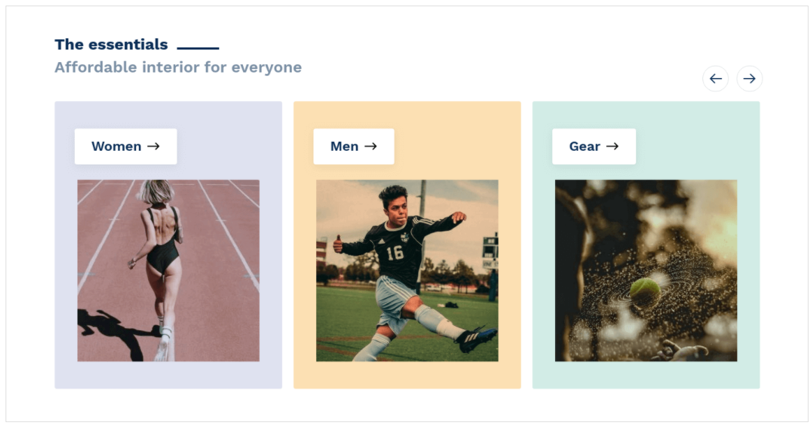
Here the piece of CMS Page content that adds this row:
<div class="jumbotron block-categories">
    <div class="container">
        <div class="block-title">
            <strong role="heading" aria-level="3">The essentials</strong>
            <p class="subtitle">Affordable interior for everyone</p>
        </div>
         {{widget type="Swissup\Easycatalogimg\Block\Widget\SubcategoriesList" category_count="100" subcategory_count="0" column_count="3" show_image="1" image_width="320" image_height="320" template="Swissup_Easycatalogimg::list.phtml" hide_when_filter_is_used="0"}}
    </div>
</div>
Explore Our Store
Here are 4 tabs shown: New Products, Special Offer, Bestsellers, Popular Products.
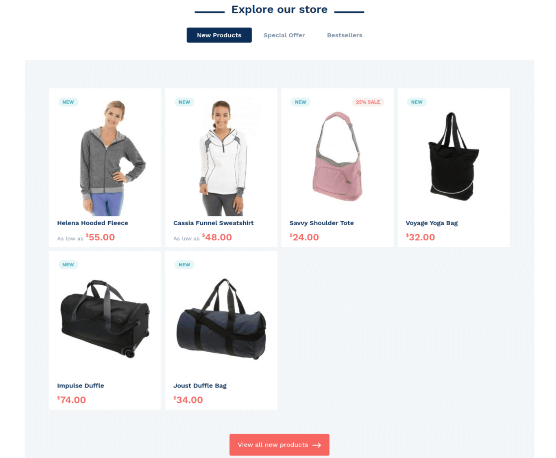
It is powered by Easy Tabs module. You can add/remove tabs, change tabs layout, etc. Visit the module page to learn more.
Here is the piece of CMS Page content that adds tabs:
<div class="jumbotron block-explore">
    <div class="container">
        <div class="block-title">
            <strong role="heading" aria-level="3">Explore our store</strong>
        </div>
        {{widget type="Swissup\Easytabs\Block\WidgetTabs" filter_tabs="new.products,special.offer,bestsellers,popular" tabs_layout="collapsed" template="Swissup_Easytabs::tabs.phtml"}}
    </div>
</div>
Our Brands
This row is slider with brands your store offers. It is regular HTML content presented as a slider with Slick Carousel.

Here is the piece of CMS Page content for this section:
<div class="jumbotron block-brands">
    <div class="container">
        <div class="block block-carousel">
            <div class="block-title">
                <strong role="heading" aria-level="3">Our brands</strong>
            </div>
            <div class="block-content">
                <div class="slick-slider" data-mage-init='{"slick": {"slidesToShow": 6, "slidesToScroll": 1, "dots": false, "autoplay": true, "swipeToSlide": true, "rows": 0, "lazyLoad": "ondemand", "responsive": [{"breakpoint": 768, "settings": {"slidesToShow": 4}}, {"breakpoint": 600, "settings": {"slidesToShow": 3}}, {"breakpoint": 480, "settings": {"slidesToShow": 2}}]}}'>
                    <div><a href="#"><img data-lazy="{{view url='images/brands/ancestry.png'}}" alt="" width="200" height="78"/></a></div>
                    <div><a href="#"><img data-lazy="{{view url='images/brands/expedia.png'}}" alt="" width="200" height="78"/></a></div>
                    <div><a href="#"><img data-lazy="{{view url='images/brands/skyscnr.png'}}" alt="" width="200" height="78"/></a></div>
                    <div><a href="#"><img data-lazy="{{view url='images/brands/twtr.png'}}" alt="" width="200" height="78"/></a></div>
                    <div><a href="#"><img data-lazy="{{view url='images/brands/uber.png'}}" alt="" width="200" height="78"/></a></div>
                    <div><a href="#"><img data-lazy="{{view url='images/brands/viber.png'}}" alt="" width="200" height="78"/></a></div>
                </div>
            </div>
        </div>
    </div>
</div>
Block “Try Now”
This is pure HTML content. It helps you to show off your products, design solutions or special bundles.
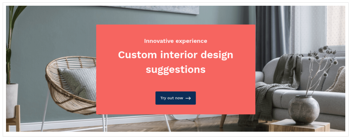
Here is the piece of CMS Page content for “Try Now” block:
<div class="jumbotron no-padding a-center block-try-now">
    <div class="element background-divider a-center">
        <img src="https://argentotheme.com/media/wysiwyg/interior/home-interior.jpg" alt="Interior Design" />
        <div class="content">
            <div class="block-title">
                <p class="subtitle">Innovative experience</p>
                <strong role="heading" aria-level="3">Custom interior design suggestions</strong>
            </div>
            <a href="https://argentotheme.com/" title="Try out now" class="action"><span>Try out now</span></a>
        </div>
      </div>
</div>
Our clients love us
This row has a slider with clients' feedback about their experience with your store. We used a Testimonials module's widget to show it. Visit the module page to learn about advanced possibilities.
Here is the piece of CMS Page content that adds clients feedback:
<div class="jumbotron block-testimonials">
    <div class="container">
        {{widget type="Swissup\Testimonials\Block\Widgets\Slider" items_number="6" title="Our clients love us" slides_to_show="3" show_rating="1"}}
    </div>
</div>
